-
The galaxy of the No.1 paintbrush
A conversation with artist Anita Paegle
Aiga Dzalbe, Art Critic
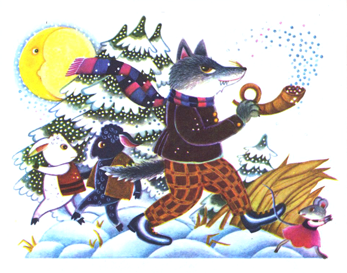
If someone came up to us and said: “See, that’s what the world looks like!”, I would oppose indignantly, saying that it’s pure nonsense – everyone needs their own world, every child even knows that these days. Some like to eat well, others like extreme travel adventures. If you asked a cat what it had seen in the splendid palace, or what’s new in court, it’d reply – “I saw a little mouse on the mat”. Anita Paegle is an artist who is superbly adept at the visual representation of children’s literature. The world she draws is infinitely captivating and completely credible. Strangely, without being the least bit didactic, it also turns out to be educational and stirring of the imagination. In the delicate drawings, each detail (even letters and plants) is able to conjure up its own image, to gain a soul and enthusiastically take part in a world filled with secrets.
Delighted by the fact that the artist was nominated this spring for the international Hans Christian Andersen Award for her achievement in book illustration, I invited her for a chat. Since the 1980s, Anita Paegle has illustrated 25 children’s books, devoting long hours and patient, absorbing work to every one of them. She relates that it sometimes takes her two years to create a book, at other times a few months – inspiration, concentration, ideas, sketches – all can be managed, but it’s the technique that takes up a huge amount of time.
Aiga Dzalbe: Why is the technique so labour intensive – two years for a book sounds unbelievably long? Do you only work by hand?
Anita Paegle: Yes, everything is drawn by hand, although I tend to use computerized colour for backgrounds. Individual objects and images have a finely-wrought finish, which looks good specifically on an even background. Generally I like the way a free-standing drawing looks on a white page, how the silhouette then stands out.A.Dz.: As if in silence?
A.P.: Rather – in brilliant light. I work with a tiny paintbrush, with watercolours, achieving something like a pencil finish. When the colours dry they become a little softer than in drawing, but after printing, the relationship between the tones turns out to have once again inexplicably changed. Large drawings with tiny brush strokes – completing them is a real pleasure – you see how initially the paper glistens through, then only a small lustre remains and a silhouette emerges, the drawing begins to glow.A.Dz.: Are the images which you draw already in your head, or do they come from life or photographs? Do you have your own collection of images?
A.P.: The first thing is the initial idea that springs to mind on reading the text many times over. I feel a genuine pleasure if there are images in the text that are mine already, otherwise they appear in the illustrations as background or as a detail. Then I look at nature, and photographs as well – at individual details, but whatever’s been clear and thought through already at the start usually turns out to be much more similar, more suited to the character, than what I see in real life. My hand moves along as if it knew everything already. While I’m still drawing a poppy in the garden, all of the petals have long since flown off into the air.A.Dz.: How does the choice of a book to illustrate come about – do you accept offers from publishers? Do you reject some too? Do you only collaborate with your own crowd of authors (Jānis Baltvilks, Māra Cielēna seem to be your most common collaborators, as well as Pēteris Brūveris, Juris Zvirgzdiņš and Lauris Gundars)?
A.P.: There have been occasions when I read a manuscript and no thoughts spring to mind, or I come to the conviction that it is a job for some other specific artist. I have rejected jobs not just due to the content but also due to time constraints – they have to be patient people to wait a year, or a year and a half, for my illustrations. With Māra Cielēna it usually happens that what I read, right from the start, turns out to be familiar and dear, as if coming from childhood. The surprising thing is that my dreams are not mine alone.A.Dz.: Interesting, what do the authors say about the appearance of the character they’ve created? Film adaptations of literary works quite often can be completely unpalatable because of the
wrong appearance of the hero...
A.P.: Yes, you suffer when there’s that face that doesn’t fit... I’d really have to ask the authors straight out. What appears in the books is my understanding and feelings about the text.A.Dz.: You succeed in connecting the text with the picture. Here, for example, (I’m looking at the book Divas pastaigas [‘Two Walks’]) – on one double-page opening seven slim wasps have gathered, with eight rotund beetles next to them, from which one can calculate four times two eights. In the book Pele, Punkts un Gūtenbergs [‘Mouse, Full Stop and Gutenberg’] the author himself appears in the image of the legendary creator of the printing press.
A.P.: Yes, this came about quite by chance. For Juris Zvirgzdiņš’ book, I simply drew large, huge letters for about 4–6 months. Unfortunately, all of the originals got stolen. I drew a portrait of Zvirgzdiņš and looked at various engravings of Gutenberg – and discovered a certain likeness. When working with Jānis Baltvilks, I often had to research plants, bugs, birds and flowers in an encyclopaedic fashion, and then all at once to throw myself into the feeling of summer in a poem. Jānis always wrote the Latin names of the plants mentioned in the poems, so that it would be easier for me to find them in plant guides. St. John’s Wort, peppermint, I remember a strawflower field from childhood – pink and soft, which I was already drawing as a five year old. There was a special frisson about the search for the “ancītis” [Agrimony] plant, as I get called Ancīte as well.A.Dz.: So children can rely on the fact that the things written about really do look like the accompanying illustration. The evil characters in your drawings – where have they disappeared?
A.P.: They are there, the evil, angry, miserly, sullen ones, pulling their faces as hard as they can into those unpleasant grimaces. Maybe that’s a problem for me: that nothing turns out really frightening or terrible. I consciously avoid it, leaving it open to the fantasy of the children themselves. Only some little teeth, a leg which is taking a threatening step, or a gloved hand appears... To tell the truth, in my own childhood I used to skip pages in the book whenever frightening story characters ap peared.A.Dz.: Do you keep an eye on the real target audience of your work – the children of today?
A.P.: We’ve often travelled from the editorial offices of Zīlīte and Ezis magazines to schools, showing the children how books are made and in this way we’ve formed a dialogue with a whole range of very different children – from the country and the city. We’ve heard such wonderful, inspiring questions; bashfully they’ve shown drawings of their own. Children have their own matters of interest that excite them – even fastpaced, aggressive cartoons in which every second moment something is destroyed, then comes back to life in a flash and attacks again. We show them an alternative – how interesting it is to delve into things, to explore, to draw by hand, how diverse artists’ styles are.A.Dz.: What kind of books did you enjoy in childhood?
A.P.: I saw one of them recently in a second hand bookshop – a black and white booklet of photographs about the Riga Zoological Garden. The dormouse was portrayed there in such a moving way, that I hadn’t for gotten its expression in 50 years (it tends to appear in my illustrations). I liked colouringin books with detailed drawings of plants. Some books were like toys, enjoyed thousands of times. From a later age I remember Sīpoliņa piedzīvojumi [‘The Little Onion’s Adventures’] with black and white illustrations, which I coloured in so that they would look better.A.Dz.: How did you become an illustrator of specifically children’s books?
A.P.: Already from childhood I was constantly watching and drawing. That was the most interesting thing for me. In the country side, where there was a lot to note down so that I wouldn’t forget, I cre ated my own picture books: for example, about the little white currant bush that froze, or a little chick that died. On a farm everything changes so quickly. My mother’s sister took me to the Rozentāls School. At the Academy, in the Graphics Department where I studied under Gunārs Krollis and Pēteris Upītis, I really got to like etching, woodcarving too. They were able to get me interested in book illustration, got me used to an unrelenting pace of work. After completing studies at the Academy, however, I felt as if I hadn’t seen colours for centuries.A.Dz.: Doesn’t animation, which is currently so popular, interest you at all? Your characters look as if they were tailormade for it.
A.P.: Moving images that run away, eh? They run away in the same way in books as well. I think I probably prefer the format, paper and smell of a book, the way you can flip the pages forward or backward. Now the new technology allows you to choose moving books as well, interactive ebooks.A.Dz.: What’s your view on the current situation as regards book illustration and design in Latvia?
A.P.: I believe that we have something to be proud of. Often I can tell that it’s a good book, even though the writer’s style isn’t to my taste. It’s this diversity that is especially valuable. A book is good if the text and the illustrations are united in the same feeling, if they’ve succeeded in finding this, if the text is in harmony with the image. Others may work with the principle of contrast, and that can be interesting too.
A lot of cutandpaste now tends to dominate in illustration; the daubs where someone, it seems, has swept a big brush asymmetrically right across all the text, are beautiful. Styles are quite varied. A busy book bursting with pictures can be good too. The design and lay outs tend to be interesting, but you’ve got to be careful with those. On my travels I look at the countless books on bookstore shelves, and I am tempted to buy some. More often than not I pick them up because of their attractive cover design, but after flicking through them, put them back on the shelf, disappointed. Just a few lines of text, a big, ugly drawing and poorly printed – lots of children’s books are like that. But a child is an attentive observer, expecting wonders, and picks up the details as well as the message as a whole.A.Dz.: What made you turn to Art Nouveau, which seems so well suited to the working environment of your images: as if botanical, teeming with little secrets?
A.P.: I find it interesting to simply draw what’s around me – ob jects that I like, architecture as well. And, you know, things that find their way into the books do change – what you draw is no longer merely a chair, it has its own character, a soul. Currently I have many things around me that exist in their own right. The feeling, living among them on another level, is interesting, it’s genuine magic. The new book that is on its way is more about Art Nouveau in the context of it being a treasure from a particular period.A.Dz.: Are you able to express everything that you think and feel about the world that surrounds you in your illustrations?
A.P.: I suppose I can. You can say a lot with a pose, gestures, com position, mood. However, the most important thing of all is to find that little nuance which isn’t obvious, and not to tell the whole story. -
A.Dz.: How does the choice of a book to illustrate come about – do you accept offers from publishers? Do you reject some too? Do you only collaborate with your own crowd of authors (Jānis Baltvilks, Māra Cielēna seem to be your most common collaborators, as well as Pēteris Brūveris, Juris Zvirgzdiņš and Lauris Gundars)?
A.P.: There have been occasions when I read a manuscript and no thoughts spring to mind, or I come to the conviction that it is a job for some other specific artist. I have rejected jobs not just due to the content but also due to time constraints – they have to be patient people to wait a year, or a year and a half, for my illustrations. With Māra Cielēna it usually happens that what I read, right from the start, turns out to be familiar and dear, as if coming from childhood. The surprising thing is that my dreams are not mine alone.A.Dz.: Interesting, what do the authors say about the appearance of the character they’ve created? Film adaptations of literary works quite often can be completely unpalatable because of the
wrong appearance of the hero...
A.P.: Yes, you suffer when there’s that face that doesn’t fit... I’d really have to ask the authors straight out. What appears in the books is my understanding and feelings about the text.A.Dz.: You succeed in connecting the text with the picture. Here, for example, (I’m looking at the book Divas pastaigas [‘Two Walks’]) – on one double-page opening seven slim wasps have gathered, with eight rotund beetles next to them, from which one can calculate four times two eights. In the book Pele, Punkts un Gūtenbergs [‘Mouse, Full Stop and Gutenberg’] the author himself appears in the image of the legendary creator of the printing press.
A.P.: Yes, this came about quite by chance. For Juris Zvirgzdiņš’ book, I simply drew large, huge letters for about 4–6 months. Unfortunately, all of the originals got stolen. I drew a portrait of Zvirgzdiņš and looked at various engravings of Gutenberg – and discovered a certain likeness. When working with Jānis Baltvilks, I often had to research plants, bugs, birds and flowers in an encyclopaedic fashion, and then all at once to throw myself into the feeling of summer in a poem. Jānis always wrote the Latin names of the plants mentioned in the poems, so that it would be easier for me to find them in plant guides. St. John’s Wort, peppermint, I remember a strawflower field from childhood – pink and soft, which I was already drawing as a five year old. There was a special frisson about the search for the “ancītis” [Agrimony] plant, as I get called Ancīte as well.A.Dz.: So children can rely on the fact that the things written about really do look like the accompanying illustration. The evil characters in your drawings – where have they disappeared?
A.P.: They are there, the evil, angry, miserly, sullen ones, pulling their faces as hard as they can into those unpleasant grimaces. Maybe that’s a problem for me: that nothing turns out really frightening or terrible. I consciously avoid it, leaving it open to the fantasy of the children themselves. Only some little teeth, a leg which is taking a threatening step, or a gloved hand appears... To tell the truth, in my own childhood I used to skip pages in the book whenever frightening story characters ap peared.A.Dz.: Do you keep an eye on the real target audience of your work – the children of today?
A.P.: We’ve often travelled from the editorial offices of Zīlīte and Ezis magazines to schools, showing the children how books are made and in this way we’ve formed a dialogue with a whole range of very different children – from the country and the city. We’ve heard such wonderful, inspiring questions; bashfully they’ve shown drawings of their own. Children have their own matters of interest that excite them – even fastpaced, aggressive cartoons in which every second moment something is destroyed, then comes back to life in a flash and attacks again. We show them an alternative – how interesting it is to delve into things, to explore, to draw by hand, how diverse artists’ styles are.A.Dz.: What kind of books did you enjoy in childhood?
A.P.: I saw one of them recently in a second hand bookshop – a black and white booklet of photographs about the Riga Zoological Garden. The dormouse was portrayed there in such a moving way, that I hadn’t for gotten its expression in 50 years (it tends to appear in my illustrations). I liked colouringin books with detailed drawings of plants. Some books were like toys, enjoyed thousands of times. From a later age I remember Sīpoliņa piedzīvojumi [‘The Little Onion’s Adventures’] with black and white illustrations, which I coloured in so that they would look better.A.Dz.: How did you become an illustrator of specifically children’s books?
A.P.: Already from childhood I was constantly watching and drawing. That was the most interesting thing for me. In the country side, where there was a lot to note down so that I wouldn’t forget, I cre ated my own picture books: for example, about the little white currant bush that froze, or a little chick that died. On a farm everything changes so quickly. My mother’s sister took me to the Rozentāls School. At the Academy, in the Graphics Department where I studied under Gunārs Krollis and Pēteris Upītis, I really got to like etching, woodcarving too. They were able to get me interested in book illustration, got me used to an unrelenting pace of work. After completing studies at the Academy, however, I felt as if I hadn’t seen colours for centuries.A.Dz.: Doesn’t animation, which is currently so popular, interest you at all? Your characters look as if they were tailormade for it.
A.P.: Moving images that run away, eh? They run away in the same way in books as well. I think I probably prefer the format, paper and smell of a book, the way you can flip the pages forward or backward. Now the new technology allows you to choose moving books as well, interactive ebooks.A.Dz.: What’s your view on the current situation as regards book illustration and design in Latvia?
A.P.: I believe that we have something to be proud of. Often I can tell that it’s a good book, even though the writer’s style isn’t to my taste. It’s this diversity that is especially valuable. A book is good if the text and the illustrations are united in the same feeling, if they’ve succeeded in finding this, if the text is in harmony with the image. Others may work with the principle of contrast, and that can be interesting too.
A lot of cutandpaste now tends to dominate in illustration; the daubs where someone, it seems, has swept a big brush asymmetrically right across all the text, are beautiful. Styles are quite varied. A busy book bursting with pictures can be good too. The design and lay outs tend to be interesting, but you’ve got to be careful with those. On my travels I look at the countless books on bookstore shelves, and I am tempted to buy some. More often than not I pick them up because of their attractive cover design, but after flicking through them, put them back on the shelf, disappointed. Just a few lines of text, a big, ugly drawing and poorly printed – lots of children’s books are like that. But a child is an attentive observer, expecting wonders, and picks up the details as well as the message as a whole.A.Dz.: What made you turn to Art Nouveau, which seems so well suited to the working environment of your images: as if botanical, teeming with little secrets?
A.P.: I find it interesting to simply draw what’s around me – ob jects that I like, architecture as well. And, you know, things that find their way into the books do change – what you draw is no longer merely a chair, it has its own character, a soul. Currently I have many things around me that exist in their own right. The feeling, living among them on another level, is interesting, it’s genuine magic. The new book that is on its way is more about Art Nouveau in the context of it being a treasure from a particular period.A.Dz.: Are you able to express everything that you think and feel about the world that surrounds you in your illustrations?
A.P.: I suppose I can. You can say a lot with a pose, gestures, com position, mood. However, the most important thing of all is to find that little nuance which isn’t obvious, and not to tell the whole story.
Anita Paegle (C)
Built with Berta.me